
Are you seeing a rise in activity from mobile devices?
Commerce Vision customers are witnessing steady growth in eCommerce activity from mobile devices, with some - especially B2C businesses - now attributing around 50% of their total clicks to mobile users. This trend is playing out all across the industry with Australia Post reporting that in 2017, 1 in 5 online sales were made from a mobile device. - "Inside Australian Online Shopping" - Australia Post 2018 eCommerce Industry Paper.
Now more than ever, it's important to optimise your website for the devices and users who are accessing it. With our 'Show on Mobile/Tablet/Desktop' widget options, you can segment content and create custom views to tailor your website for each device type.
 Photo by Tom Holmes on Unsplash
Fully Responsive BPD (Best Practice Design)
All of our BPD sites utilise a fully responsive page layout. Without any further configuration, your content will dynamically wrap and resize to fit both the screen size and orientation of any device chosen to view your site. While this responsiveness is great for helping your desktop content to adapt, some content just isn't ideal for mobile devices and should be removed altogether, or replaced with more suitable material.
Mobile, Tablet, and Desktop display options - (min version 4.02)
While our fully responsive design changes how your content is viewed on various screens dynamically, our Show On Mobile/Tablet/Desktop functionality will allow you to easily configure what can be viewed by each device. This provides the opportunity to create more tailored views that can be further optimised for performance and user experience.
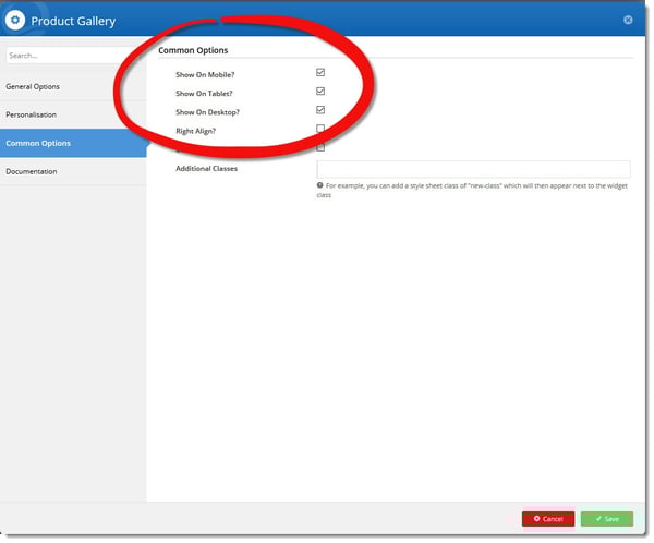 These options are available in each widget under the Common Options tab.
Examples of Mobile Optimisation
De-Clutter
Be selective with your content and display appropriate information for each device type.
Set widgets with lengthy full content to only ‘show on desktop’, and remove them from mobile device views.
A clever shortcut is to make a copy of an existing widget and update it with abridged content. Then, set it to just ‘Show on Tablet’ and/or ‘Show on Mobile’. The new widget can provide more appropriate content that looks and reads well on smaller screen types.
Improve Performance
Page load speed affects not just your users’ experience, but also your search rankings, and on mobile devices speed is even more critical.
In addition to reducing or removing excess content, you can also achieve performance gains by displaying smaller or fewer images.
As in the De-Clutter example above, you can create new (or copy existing) widgets, then remove or replace the images with smaller resolution versions and set them to only ‘Show on Tablet’ and/or ‘Show on Mobile’.
Additional Options for Banners
If you've got a banner slider but would prefer to limit the display of one or more images in the group, that’s possible too.
In Banner Maintenance, edit the individual banner and select Desktop, Mobile, or Tablet from the dropdown. This setting will take precedence over whatever is set on the Banner Slider widget.
For more information see our Knowledge Base article - Mobile, Tablet, and Desktop display options
If you would like to discuss mobile optimisation you can contact me at any time.
Until next time…
Shaun Cooper
Customer Success Manager
Commerce Vision