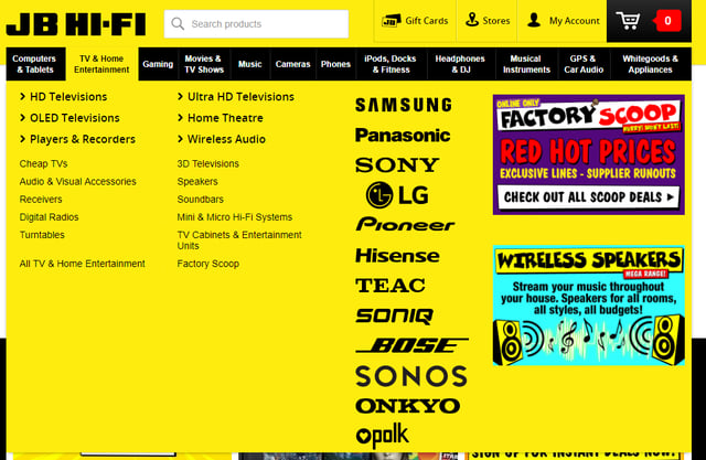
This week we’re putting the spotlight on those mega-menus. You know, these things:
Websites love them… but do users?
Lucky for you I went diving through the internet to find answers.
The short answer: no… and yes.
There are a few main points to cover, so let me break them down.
Giving users too many options is actually bad for them.
When we’re walking through a department store we want variety. We want to browse. When we’re looking at websites (specifically ecommerce), that same mentality is actually detrimental to the user experience.
We’ve spoken about it before. I call it decision paralysis. It’s more commonly known as analysis paralysis (bit of a tongue twister). Kissmetrics wrote about it in their blog Are You Making These Common Website Navigation Mistakes? As we’ve rhymed before, less is more. People can only remember 7 things at once (that’s right - 7!) Here’s the science behind it. So giving them a million options not only confuses them, it’s also useless since they won’t remember them anyway.
The way is always Mega!
Please jeebus no. This one is a two-parter so let’s get into it:
Mega part 1: Do you need it?
Sure, the simplest way to display all the information to your user straight away may be via mega-menu. But is straight away a good thing? It’s worth remembering that simplicity for you doesn’t necessarily translate to simplicity for your customer. This blog breaks it down beautifully. Don’t worry, Cliffs Notes are coming at you:
Effectively, if a company has a very broad catalogue of products, then it may be beneficial to offer a mega-menu (what’s up Amazon!). Having said that, don’t immediately jump on the bandwagon. If you don’t really need it, removing it can be a great way to reduce the clutter and cognitive load of your site.
The less thinking your user has to do in order to find what they want, the happier (and more likely to get to the checkout) they will be.
Mega part 2: Are you doing it right?
Like most parts of a website, there are conventions when it comes to mega-menus. It can be tempting to come up with something revolutionary and totally unique… Don’t do it. Not with navigation. Remember that cognitive load I mentioned a moment ago? It’s super important. A user shouldn’t need to employ max brain power to find their way around your site. A convention may not create a revolution, but it creates familiarity. Crucial when you’re already throwing a lot of information at a user. This post from selfstartr breaks it down nicely. Here’s the most relevant bit to today’s post:
Primary Navigation Menu Do’s
- Limit top menu to 7 choices.
- Use a secondary navigation at the top right for items like “Contact Us”
- Use a multi column menu that organizes categories and sub categories…
- Show high quality images of your product.
- Make your navigation menu prominent with contrasting colors.
- Cross reference products into multiple categories. Someone looking for a USB drive may look under Laptop, Accessories, Or Computers.
While we’re on the topic of convention, please bust out those analytics! I had a great chat with the guys from TradeTools recently, as they’re looking at giving their menu a bit of a refresh. You know the bit that made me want to high-five them through the phone? They’d based their featured categories on analytics data. The categories that got the most traffic were the ones they served up first. Pretty simple once you say it, but how many sites actually do it?
© Pulp Fiction
So… are mega-menus good or bad?
As I said earlier, the short answer is both…
- Have a mega-menu but don’t need one? Bad.
- Have a mega-menu because it’s what everyone else is doing? Bad.
- Have a mega-menu without a clear flow from one category to the next? Bad.
- Have a mega-menu because you want to stuff every category on the home page? Bad.
- Have a mega-menu that’s a thoughtfully curated list of oft-used categories, presented in a user-friendly way? Good.
When considering (the awesomely important) question of site navigation, look objectively at your product offering (and your analytics!) to determine what’s warranted. Be sympathetic to your users and make finding products easy. Because Simple doesn’t have to = boring, and Mega doesn’t always = exciting.