
%201.jpg?width=315&name=gettyimages-1331173398-170667a%20(1)%201.jpg)


I couldn't resist a subtle Beyoncé reference in there. I needed something to lighten the mood because I'm about to say something a lot of people may not like to hear. Ready? Here we go:
Don't use a banner slider.
No, really. Even if you think you need it... You probably don't. Don't do it.
I realise that asking you to just take my word for it is probably stretching the friendship a little, so I'm going to take you through some of the research I found when I was asked by a client if a slider would solve their problem. But before I do that I want to show you something really simple and really effective.
This website:
http://shouldiuseacarousel.com/
That slider sure gets annoying after a few minutes, right? It's either too fast or too slow. The navigation is clunky and, if you managed to sit through every slide, it raises some pretty strong reasons not to use one.
If you didn't (or couldn't) sit through the whole thing then don't worry - I'd like to lay it all out for you.
Let's start with the obvious. What are some of the main reasons you might want a slider on your home page in the first place?
- You've got limited space and a lot to say.
- You have multiple deals going on and want to tell your customers about all of them.
- 4 calls to action have to be better than one, right?
When in doubt, I'll go with what the data tells me. So I did some digging and came across a couple of really good studies. The first was performed by the University of Notre Dame and tracked not only the click-through rate, but the breakdown of that click-through rate across each slide. There are two key points I think are absolutely crucial (though you can read the whole study here).
- A total of 1% of users actually clicked on any of the banners presented in the slider.
- Of that 1%, 84% clicked on the first slide.
This graph breaks down the distribution of that 1% of users.
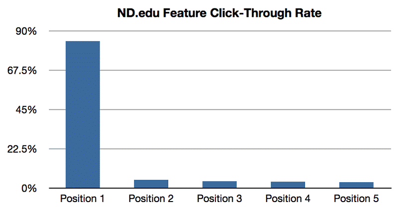
All of this screams one thing to me. If you're using sliders on your home page, you are using the single most valuable real estate on your website for an average 1% conversion rate. Those are not the kind of stats I love to see.
Still not convinced?
That's ok, I wasn't either. So I kept digging, and found another study performed by Nielsen Norman Group. This time the focus was usability; understanding WHY that 1% was only 1% (though the studies were conducted independently of one another). The biggest thing they confirmed is something called Banner Blindness. This eye-tracking heat map (source) does a pretty good job of explaining it.
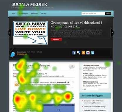
How often do you see the big call to action at the top of the page and your eyes just slide right past it? You're not alone. There are more heatmaps and studies I could show you, all confirming the same behaviour. Essentially, because it moves, people assume it is advertising. Advertising is not why they are on the site, therefore it is irrelevant and they ignore it.
STILL not convinced?
Let’s go back to those oft-cited reasons for wanting a sliding banner in the first place.
If you have multiple messages you want to get across, have you considered what message a sliding banner is really sending to your end user? The more information they have to take in - if they even see it to begin with - the more you're asking them to make decisions (I’ve mentioned the Analysis Paralysis concept before when talking about metadata).
Effectively, you're diluting your own message, and your ideal user path. Instead of seeing a single image that tells them what your primary focus is, they see three - often not related to one another (beyond the fact that you're behind them all). So... what exactly are you selling again? They're no longer sure.
So, to revisit those 3 arguments:
- You've got limited space and a lot to say.
True. However, having a banner slider only reduces this space further. It's hindering rather than helping you.
- You have multiple deals going on and want to tell your customers about all of them.
You want to tell your customers about all of them, but you're actually telling them about none of them because they're not seeing them. Consider things like layers to target your message to the right people, rather than broadcasting everything to everyone.
- 4 calls to action have to be better than one, right?
Studies say the answer to that is a resounding “no”. You’re only getting an average of 1% click-through on some of the best real estate on your site! Tragedy.
Now I think it’s pretty obvious I’m not a huge fan of sliders. But! That isn’t to say they don’t have their place, or that they aren’t necessary under certain circumstances.
One of the key takeaways from the research above was around the movement associated with the slider. I’ve seen some great, engaging banners that DO have multiple slides. The difference being that I can click through them at my own pace.
A customer recently sent me through this great example of sliders done well (if you’ll excuse the German):
https://storesandgoods.com/interior
Note the clear indications of potential movement: the radio icons at the bottom and the arrows on either side. These announce to the user that there are other images waiting for them when they are ready to see them.
I know banners are a hot topic for many, so I didn’t want to leave you without letting you know the most important piece of information. As of our latest release, it will be possible to turn the automatic animation off entirely, allowing your users to browse at their own pace.
I would never presume to know every reason your business has decided it needs a slider. Some of the reasoning may have nothing to do with the user and everything to do with your suppliers, for instance. That is a business decision every organisation has to weigh up.
Just make sure you’re asking the question in the first place:
Do we really need it?